Tuesday, 5 April 2011

AD108:application in art and design 1: editorial

editorial piece:double page spread with follow on page.
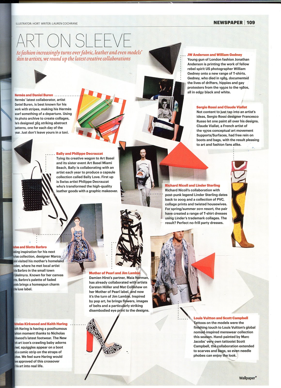
influenced by the way the body type is set out from my research


how the background is fluent on the page with the type layed on top with a colour block box underneath the text to make it stand out on the page and keep it legiable.
this also influenced my design from my research.


images that influenced my ideas, from the v festival advert 2009


In my research of effective editorial pieces I look at how layout is handled with its content and what content is used in the magazine layouts that I thought where affective, of which I had found that they worked most affectively if they had used the same appearance to the background and overall kept the magazine relatively simple with most magazines tending to use white in the background (white space) to a) keep printing costs down and b) is used sometimes to bring balance to the foreground with the bold black text usually used in contrasting in dark and light tones, that can make it stand out without adding to much the page and overdoing it.
This is one thing is I had to think about with the text whilst developing my design aswell as how the text is set out and how it can shape around imagery or it text can be used as imagery.

My given subject of which my editorial piece is based is the v festival, before this I had never heard of the V Festival and never knew it even existed, so firstly I had conducted research on this subject matter, finding out the general information about the festival, i.e the location, being a weekend long, its rules etc.
After researching my subject I then thought about what I could do the article based on the V Festival, which lead to doing it based as a survival guide to the v festival, being such a big event that everyone wants to go to with lots of things people may not know or things that may help with some sort of idea forming of what I could do I from Looking at my research with wellies and the basically grass being the main focus point linking in with the festival because its scenery surroundings and how it usually rains which links in to the idea of survival for a survival guide.

I also looked at different ways of presenting my ideas in terms of layout ideas for my my initial ideas I did with 2 in mind knowing I am going to try out.
For this I thought about the size of the text, the layout presenting the text and the imagery, how these would fit on to the page roughly as guide.

I thought about these ideas and found that the double page spread to be working more affectively with one side focused as a feature page to the image that meets in the middle and works out as the right page of the page spread to be purely for the design to mainly focus on the text.

Since it wasn’t possible for me to be there and take photos of the actual event this year, I thought that there may not be much reference I could use of my own to show the event through the photos, so I thought I may use a few photos and compile these in with some of my own drawings against some textures and illustrations, so I started drawing in fine liner and found that being inexperienced at drawing this subject was letting me down, since it was not going to turn out right visually if I could not draw the stage and people around it up to standard, and so I decided not to do the idea of the girl hanging out the circle shape with the view of the festival behind her and decide to do my other idea that would be quite fitting with the subject aswell as it being more practical to produce and develop, with using polaroid’s with each one showing some of the tips made in the body text of the article of the survival guide, that I had found from virginmedia.com/survivalguide web page.
In a sense this would also act like pull quotes with the text written on the bottom of the Polaroid explaining what each image is representing of which tip.

This would the appearance the Polaroid’s have just been taken spontaneously at the festival and fell on the grass, giving a fun but reinforcing clearly in a subtle way of the survival at a V Festival.

Thinking about this idea abit more made me realize that I could improvise and still take my own photos providing that I use a scenery similar to what the festival may have in it surroundings of its location, so I took my own photos in a big grass scenery at a park which I took of various props and poses in a subjective and action style photography aswell as photos of the grass for the background.
 I picked out the best ones and placed these inside a polaroid frame, with a new master created in InDesign and the polaroid laid on top along side the text with opaque boxes behind the text to help stand out more was not fitting in right and the grass background was pixelating, even though of which, was taken with a 12.2 megapixel camera.

Since this was not working like I had initially planned, this had resulted in taken some more photographs of the grass and found that the darker the grass the more its works in with the text and I had to experiment with fonts and colours used in the header, sub header, body text and the opaque box the ended up being scrapped off the double page spread and found the most affective way is to have the body text black and have a white background on the second page but use a feather edge rectangle box in its place from where the opaque box would have been. The font of the header, intro text and body text changed a number of times to end up with fonts century gothic for the body text, being sans serif - rounded modern and clear to read, justdownhere – for the text to caption on the polaroid’s and carrying on this style from that page on to the second page, aswell as it being more fitting in its appearance and place of use in the intro text with its quirky, fun and handwritten appearance.

Making these amendments to the colours of the text changing to black of the body text and adding colours to the sub header and subtitle aswell as fixing out the background to be used behind the text has made a real effective impact, being abit more simpler, easy to read, more prominent and stands out on the page a lot more.

I also placed the polaroid on the follow on page, one being enough to accommodate the text and maintaining its balance of its design with the grass in the background and feathered edge boxes behind the text in white with the body text in black turned out being just right and fitting in around the text with a text wrap without changing it size, made this decision to only have the polaroid to be used on this page in the middle of the second column.

I then found the body text to be plain and the subheading where not standing, so to make it do this, I made each sub header bold and added a splash of colours to it which as made it easier to navigate and skim through the

Initially I had also planned to have 3 columns in the body text but found it to be a bit squashed in appearance, so I made it 2 column in its place instead which works more affectively, sentences not too long to read in length and not squashed looking, so I carried this 2 columns through out my development and in to my final design.

Overall I think my project went all right, it came together in the end the more that I had developed it with fonts, colours and making the sub headers stand out with making it bold and adding a splash of colours taken from the colours palette of the header- brown and green to it made it easier to navigate/skim through the content and adding little touches such as page furniture with numbers and the name of the magazine really bring it together, turning out more better than I thought it was going to be before.

If I was to do this project again the only thing I would change is that I would have another attempt at that first idea by experimenting quite a bit more with my drawing skills, practicing trying to draw the image more better, trying water colours or fine liner and illustrator together and maybe mix this In with photography and vector graphics, producing a mixed media piece compiled together and resulting in a interesting and striking final piece that would run through from the first page and link on to the second page then maybe the follow on page.


my final editorial design

 double page spread


follow on page


 SWOT Analysis

•   Strengths - What did I do well?: time management and i have grown quicker in writing reports and essays since doing more, i have became more confident than i had before. 
•   Weaknesses - What do I need to improve?  having printed some editorial pieces out i find the image cut off from the bleeds.

•   Opportunities -What do I need to do to build on my strengths and weaknesses? need to practice working with bleed in workin indesign and editorial design.

keep practising and building on my strenghts so that it comes naturally.
•   Threat - What could stop me achieving my goals? if i dont keep up to date and not keep on top of courework with not using time management.


SMART 


  • •   Specific - Well defined: practice drawing my drawing skills, to help when it comes to times when illustration is involved and it having to be of a standard.
  • doing this will this up my drawing skills and will be quite useful
  • Measurable - Know when it has been achieved: when my drawings are have progressed and i am able to see a diffrence in comparison from before.
  •    Achievable – Are the goals achievable: it is achieveable, it may take some time as it will be the matter of practice makes perfect.
  • Realistic - Within the availability of resources, knowledge and time: i will use diffrent materials to practice with, look at some books that provide tips. this will be done in my own spare time.
  •  Time Based - Enough time to achieve the goal: this will take some time to occur, this may begin to happen at the end of the academic year.

blue bridge live brief


further development lead to the my final outcome, with the symbol move to the side above the text with a left alighnment  

the brief was to design the logo as fresh brand for the students on the course of the music department that run a music company as part of their coursework at newcastle college.
Being no existing branding already, everything was from scratch with only the design requirement of staying away from bridges.
they asked for it to be called blue bridge, this could be one or 2 words and it needed to have  the word ''records" added.
The branding design with the logo will be applied to everything from t-shirts, stationary,posters etc.
this made me think about the sizing restraints and how it had work in the same way as music companies like virgin work as this brand also had to apply to all genres of music.
i find simplicity always works most affectively when branding, this is what i kept in mind whilst designing my logo and looked at current music companies logos such as sony, virigin etc

 being a logo to work effectively i thought carefully about the layout, at first i found the style and the layout of my designs working this such way as this as pictured in the top image but after some more development of the layout having the symbol moved to the side of the text and the text aligned left this seemed to represent more as record label you would see today. find this workng most successfully as in the image above.

I found that the black makes a bold statement and will stand out the most being more affectively when applied to the backs of cd cases etc but i also added in the choice of colour with the obvious choice to use blue, to link the logo to its name.
This also gives a nice outcome and still looks modern adding abit of edge but the black and white design of it works the best in terms of its design.


Tuesday, 22 March 2011

4 local design companies in tyne and wear

1Different


“make a difference”
In just over ten years Different has evolved from just four blokes  with one client and no staff, to a creative force which currently stands at 45. They have offices located in Newcastle and London.
They are an award winning design agency, and have become one of the biggest in the North-East.
http://www.different-uk.com/

What they do…
•social media •direct marketing •TV •print and radio •digital content •branding •advertising


CLIENT:NHS Smoking and Pregnancy
Synopsis
The brief was to encourage pregnant mums to quit smoking for the sake of their baby's health without preaching.

A key objective was to raise awareness of recently launched smoking cessation services designed especially for pregnant mums – awareness and uptake had been low previously due to lack of engagement.


2 Drummond Central Newcastle

Founded in 2004
A strategic marketing, creative and digital agency that researches, plans, creates and delivers, readying your brand striving for perfection.
http://www.drummondcentral.co.uk/

What they do…
•advertising •research and planning •direct marketing •communications •digital design •copywriting

CLIENT:Bet365
2010/11 football season TV ad
“A lot can change in 90 minutes”
bet365 is at the heart of In-Play betting. Featuring Ray Winstone standing in a stadium, our ad
talks about how a lot can change in ninety minutes. As we near the end of the ad, the stadium
has transformed into the bet365 logo. The ad is part live footage and part CGI and took four months to complete - we're very pleased with the result.


3 Solution group
solution group 


•Who they are:
•Local Graphic design company from Gateshead that provide clients with design, illustration, art direction, photography and writing.
• they employ multi talented staff and run their operations on the basis that their clients come to them for a return on their investment that's way better than average.
They have worked with some big national brands and have won many awards from their own and other industries each year.


CLIENT:The sage:gateshead
The design for an out-there contemporary music festival at the Sage Gateshead was to produce the Music Lover's Field Guide, complete with a specially designed typeface that suggested something experimental was going on.
it communicates successfully with one of the hardest-to-reach sectors of the listening community.
Being quite a coprorate company design based this is something that this company is quite familiar with and easy target, with the final outcome, it Shows how successful and affectively the design and final outcome have actually worked.


4 KELTIE COCHRANE


•Who they are:
•Keltie Cochrane is a creative partnership, that provide clients with Websites, posters, creative copy, illustration, branding, brochures, animated films – they reckon they can create whatever you name it being passionate, professional and practical.
•Being a small local company with 4 creatives:
• IAN KELTIE-Creative Partner – Design
•JASON COCHRANE-Creative Partner – Interactive
•RICHARD JEFFERSON- Creative Partner - Advertising & Marketing
•NICOLA RICKELTON-Designer - Web & Print


  • CLIENT:Codeworks gateshead council

•The brief was to create the branding, microsite and marketing material for Popcorn, a digital film festival in Gateshead.
•With being big movie fans,  and creating the branding for the Gateshead Digital Summer’s film festival, they named it in honour of their cinematic snack of choice – popcorn.
•The Popcorn microsite had to appeal to everyone from kids to teens and adults, so they created something that was fun and informative.
•The design has turned out quite successfully being instantly caputuring and fun appealing with the characters and the bright colours used against the black background.


Time plan of action

Monday 21st March-25th March 2011

planning time out for the week and the goals that needed to be achieved in this time,

Monday
Morning- sketch out more ideas of the label for the blue bridge music logo.
Afternoon- take the strongest ideas that have been sketched out, i will develop the logo by taking the next step and working with the strongest logos on the screen now,in illustrator.

Tuesday
Morning-developing the logo designs and narrowing the ideas down the design process of whats , as different fonts and layouts are being experimented with.
Afternoon-following on development of experimenting diffrent fonts and looking at the sizing of current logos to get the size, look and appearance correct.


Wednesday
Morning-norrowing the design to a final decision of which logo that will be used and just tweaking the design and the logo and any last alterations.
Afternoon-same as the morning, carrying this on with the finalisation to be ready for presentation on thursday


Thursday
Morning-showing final design of music logo to client
Afternoon-carry on with double page spread of the v-festival, need to take more grass photos and drawing grass to see which works more affectively in the background.


Friday
Morning-show development of thursday afternoon with screen shots as part of my development of double page spread and follow on.
Afternoon-any unfinished annotation to be revised and completed to be up to date with everything.

Monday, 7 March 2011

The back and forth drawing with friend project.

i came across this project on a blog called paper monster to which i found to be aspiring and interesting, so much so it had me convince to try it sometime.

so here it is:


Project 002: Mike Perry

One minute back and forth drawing with friend(s).

November 10th, 2009
Paper Monster recently invited Mike Perry to come up with our second project and we are excited to forward it on to you guys. 
"When asked to do this project I knew exactly whom I wanted to collaborate with. So while visiting Jim Stoten in England we sat down and made this drawing. You can too..."
Directions
  • Find a friend that you want to make a drawing with.
  • Get a piece of paper and a stop watch (optional).
  • While one of you is drawing the other times you for 1 minute. After 1 minute stop and pass the drawing to your collaborator.
  • Let the time fly. All the while keeping track of how much time has passed.
  • The most important step. Have fun.
Other ideas. Choose any amount of time. What happens if you trade every 30 sec. or you work on a larger paper and trade every day. Really the possibilities are endless. Maybe each of you use different tools. Each of you use different color pens. Or add more people. What would happen if there where 5 people playing. And of course my favorite what happens if you drink while playing.... Endless.

will post my outcome sometime, once i've tried this.

Tuesday, 1 March 2011

freelance brief:branding for a make up artist

freelance brief:branding for a make up artist, this will include logo and stationary set complete with business card,letter head, and compliment slip

the client is for abagail mua known as graffitti eyes on her facebook group: http://www.facebook.com/GraffitiEyesMUA

she has asked for the design to be something like this:


http://www.shutterstock.com/similar-65494735/stock-vector-beauty-girl-face-design-elements.html

with a make up pattern inside or around it, i think this may be too much and she wants simple, so this may be used in a diffrent alternative or none to make it more affective.

so far i have drawn some rough ideas on this, and i will be illustrating the design myself aswell.

will post more update when progress has been made etc.

Monday, 28 February 2011

yukari terakado(寺門 縁)

yukari terakado
(寺門 縁)

With a very Japanese style, Yukari Terakado illustrations are hip and fresh. Working mostly in acrylics and colored pencils, Yukari uses seductive lines to create intricate patterns and stunning forms. I love the way she draws hair on the girls with something diffrent happening!

source: http://trendland.net/2010/10/02/yukari-terakado-illustrations/


i would like to to recreate this style that has this rough free flowing line drawing, it has contemporary young but a sophisticated look to it that would be interesting to try out in one of my designs in future.


Tuesday, 15 February 2011

AD104 Theory and Context-Typoography


Project Reflection


For this project there was no development or final to create other than to create an outcome of a finished 3,000 word essay based on typography.

So with the essay having to be on typography and having the choice to choose of anything in particular based on typography, 
i had decided to chose to write about the history behind it in the 
1900's-1990's since i thought it would be interesting to see how diffrent and how far typography has come from each decade of a century.

the structure of my essay changed abit from how i had first set it at the beginning of my essay, to suit my writting and make answering the content and aswell as asnwering the statement of the essay.
This is how my Appendix has turned out.

·      Introduction
·      In the beginning of the 20th century typography

·      Decades after:The evolution of typography-
 this will include the following aswell:

·      Typographic design trends used- How typography has changed
·      Influential typographers typographers 
·      How affairs have changed typography.
o   - SOCIAL, ECONOMICAL AND CULTURAL INFLUENCES AFFECTTING TYPEOGRAPHY AND TYPOGRAPHERS
·      Conclusion

i took alot of my research from the internet being that its of ease to find articles/websites on the subject and being so many sources with the information i need.
to keep my research as a variety i also used a book call typo:when,who,where which give me a background to each decade aswell as the notes that i had during presentation on typography in class this being my secondary research.

my primary research is my own thoughts and opinions taken from the secondary research, which i found from the books, e-books,  the internet and notes that i made in class during presentation on typography.

Although my secondary research is not facts nor fiction, there is nothing i found to be solid fact but merely suggestions and statements, about the culture,typography and typographers of the decades.

looking back at my progress and time management, i think that, i have done well as i finished my essay the before the deadline and i have spent alot of time working on my essay, adding to it constantly so much so that i find i need to cut it down, so that it ensures it will fit in with the word count.
I think being my second real long length essay i have ever written and considering the fact that i am not confident nor look forward to the idea of writing an essay, i would say i have done quite well.


I found the essay a little bit difficult after writting my introduction but i soon got going and it eased the difficulty after that.

These will be my targets and improvements to make for my next project to try and achieve on:

 SWOT Analysis

•   Strengths - What did I do well?: time management and had alot research to support my response and findings against my essays title. 
•   Weaknesses - What do I need to improve? not enough confidence in myself, this could slow me down after being so critical and contemplating if i put enough or the right content in to my work especially like this project, that involves writting essays as of essays i feel not being my strongest point
•   Opportunities -What do I need to do to build on my strengths and weaknesses? i need to have more confidence in myself and be less critical and know that if i try hard it will be alright as i will of made the right decision 
•   Threat - What could stop me achieving my goals? my weaknesses 


SMART 


  • •   Specific - Well defined:need to work on being abit more confident and little abit more self assured about what i am producing in to my work
  • Measurable - Know when it has been achieved: i will feel more confident because i will be more self assured than before and not content plating.
  •    Achievable – Are the goals achievable:yes if i work on it as much as possible
  • Realistic - Within the availability of resources, knowledge and time: i will do this from my own knowledge of how i will improve on this, with time,effort and self determination to do it, each time i approach my coursework.
  •  Time Based - Enough time to achieve the goal:next project or the next project after that should give me enough time to be abit more confident