Monday 28 February 2011

yukari terakado(寺門 縁)

yukari terakado
寺門 縁

With a very Japanese style, Yukari Terakado illustrations are hip and fresh. Working mostly in acrylics and colored pencils, Yukari uses seductive lines to create intricate patterns and stunning forms. I love the way she draws hair on the girls with something diffrent happening!

source: http://trendland.net/2010/10/02/yukari-terakado-illustrations/


i would like to to recreate this style that has this rough free flowing line drawing, it has contemporary young but a sophisticated look to it that would be interesting to try out in one of my designs in future.


Tuesday 15 February 2011

AD104 Theory and Context-Typoography


Project Reflection


For this project there was no development or final to create other than to create an outcome of a finished 3,000 word essay based on typography.

So with the essay having to be on typography and having the choice to choose of anything in particular based on typography, 
i had decided to chose to write about the history behind it in the 
1900's-1990's since i thought it would be interesting to see how diffrent and how far typography has come from each decade of a century.

the structure of my essay changed abit from how i had first set it at the beginning of my essay, to suit my writting and make answering the content and aswell as asnwering the statement of the essay.
This is how my Appendix has turned out.

·      Introduction
·      In the beginning of the 20th century typography

·      Decades after:The evolution of typography-
 this will include the following aswell:

·      Typographic design trends used- How typography has changed
·      Influential typographers typographers 
·      How affairs have changed typography.
o   - SOCIAL, ECONOMICAL AND CULTURAL INFLUENCES AFFECTTING TYPEOGRAPHY AND TYPOGRAPHERS
·      Conclusion

i took alot of my research from the internet being that its of ease to find articles/websites on the subject and being so many sources with the information i need.
to keep my research as a variety i also used a book call typo:when,who,where which give me a background to each decade aswell as the notes that i had during presentation on typography in class this being my secondary research.

my primary research is my own thoughts and opinions taken from the secondary research, which i found from the books, e-books,  the internet and notes that i made in class during presentation on typography.

Although my secondary research is not facts nor fiction, there is nothing i found to be solid fact but merely suggestions and statements, about the culture,typography and typographers of the decades.

looking back at my progress and time management, i think that, i have done well as i finished my essay the before the deadline and i have spent alot of time working on my essay, adding to it constantly so much so that i find i need to cut it down, so that it ensures it will fit in with the word count.
I think being my second real long length essay i have ever written and considering the fact that i am not confident nor look forward to the idea of writing an essay, i would say i have done quite well.


I found the essay a little bit difficult after writting my introduction but i soon got going and it eased the difficulty after that.

These will be my targets and improvements to make for my next project to try and achieve on:

 SWOT Analysis

   StrengthsWhat did I do well?: time management and had alot research to support my response and findings against my essays title. 
   WeaknessesWhat do I need to improve? not enough confidence in myself, this could slow me down after being so critical and contemplating if i put enough or the right content in to my work especially like this project, that involves writting essays as of essays i feel not being my strongest point
   Opportunities -What do I need to do to build on my strengths and weaknesses? i need to have more confidence in myself and be less critical and know that if i try hard it will be alright as i will of made the right decision 
   ThreatWhat could stop me achieving my goals? my weaknesses 


SMART 


  •    Specific - Well defined:need to work on being abit more confident and little abit more self assured about what i am producing in to my work
  • Measurable - Know when it has been achieved: i will feel more confident because i will be more self assured than before and not content plating.
  •    AchievableAre the goals achievable:yes if i work on it as much as possible
  • Realistic - Within the availability of resources, knowledge and time: i will do this from my own knowledge of how i will improve on this, with time,effort and self determination to do it, each time i approach my coursework.
  •  Time Based - Enough time to achieve the goal:next project or the next project after that should give me enough time to be abit more confident

typography basics and its basic history

Presentation on typography and some of its history
typography

View more presentations from Rob McMinn.

This is a slideshow that i came across whilst searching for research on my typography essay that focused on its history from the 1900's-1990's.
I find that it contained alot information on typography from its letterforms explain to its history, basically explained.
This is something i can look back and refresh my memory on something i may forget that i may need to know about on typography and will be useful in writting my essay as it will help my with some of the social and economic aspects of time in relation to typography. 

Monday 14 February 2011

niki pilkington

I <3
'S 
work :)

naturally drawn and talented to bring the illustration to life, even in the most in reliable mediums to work in like felt tip and biro, Niki pulls it off all the way.
Her illustrations are always subjective to fashion and girls and her most newest pieces shown at the top are brightly coloured, mixing neon colours against the greys tones of the outline and shading of the illustrations.

i like how she experiments to draw in diffrent mediums and creates her drawings mixed with cutout shapes and paper placed behind or how she adds the 3d life likeness to her drawings by adding materials in the imagery that stand off the paper, like the second image with the paper chains.

This is something i would like to try in one of my own designs in future, its quite fun, young and very contemporary.


Naja Conrad-Hansen


Naja Conrad-Hansen
 is a designer and artist who lives and works in Copenhagen, Denmark.
Coming from an artistic family, it was natural for her to choose an artistic path.
Graduating from Danmarks Design School in 2003 with a MA in Visual communication and a background in fine art; she started her profession as a freelance designer and artist in 2003. Her practice embraces illustration, painting, graphic design, art direction, and making silk-screen prints.

Inspirations comes  equally from the worlds of fashion, hardcore music, and traditional art and design and in general observing the world around her. 
The illustration style is basically about "finding some untouched areas of the mind and stimulating the eye and imagination. She is balancing her time between making art and commercial work as she finds they feed each other.

having 10 exhibitions and being known in many books/magazines.
-source: http://www.meannorth.com/cv.htm

i find her work to be fashionable,contemporary and bold.
it has similar design and taste as what i sometimes like to try out and achieve in some designs where it may suit.
i would like to try and create something bold in black with a splash of colour or just black and white like the top two images with the text worked in, this would work as poster for young adult target group


Wednesday 9 February 2011

Reflection on my designs so far

Here i am reviewing my graphic design project finals, up to this date.

looking back at them i think that i have achieved a standard higher that would be considered to be at a professional level this is something i have been trying to perfect for a few years and now achieving that, i am happy with my final outcomes, this proves, practices makes perfect, something which i will plan to continue thorough out future projects and try and better my ideas and designs as much as possible.

I have a learnt a lot in these past months since starting september, i am refining my designs more than i had before, giving results that have turned out better than i had initially thought.
i have designed items/outcomes that i have never done before and have gained more skills that have allowed me produce a better quality outcome, i.e i have bettered my illustrator skills and the pen tool, that allowed me to created my posters for the students unions, in vector graphics.

I have managed time quite well around working all weekends and producing a good standard to my sketch book, working on my project as much as possible and sometimes i even finished a day before the hand in date.

I like all my designs but my most favourite design is my chefs academy and virtual  reality project.


click images to englarge

Tuesday 8 February 2011

typography looking sweet but talking rude!


This just proves how type can be beautiful 
but deceiving at the same time as the word in the type is rude

The design is very well perceived and its type is done very similarly to a illustrator/typographer Herb Lubalin.

source: http://www.creativereview.co.uk/images/uploads/2009/04/cunt.jpg

APPLE No.1 logo favourite

Number one logo of all time

http://www.creativereview.co.uk/cr-blog/2011/february/favourites-logos-brand-new


Apple is voted number one logo on creative review by readers on the creative review 
-4 February 2011 post.

Its not surprising since there is no other logo alike and well know in its success.
The logo design has changed is slight ways of its colour from the rainbow like colour in the 90's but originated from the forbidden fruit in its original 80's design, hanging off the tree with too much going on it was a clear logo but its importantly what lead to its logo design that has lasted through the years as basically the same logo with small minor changes on the inside of its design.

since standing the test of time, it is one of the most well know and rememorable design know today being a very well designed and successesful logo.
well done apple.


Amazing interactive media : thewildernessdowntown

http://thewildernessdowntown.com/

one of best things ive seen, using interactive media and live view of google maps intergrated together to callobrate a unique experince to the user.
even the graphics and especially the typogrpahy is really nice. 
The typogrpahy is digital but it has a nice raw loose,quirky,alive, hand rendered like feel.

Check it out for yourself, i quite enjoyed it myself.


periodic table of typefaces

As doing my current module on typography i found this and thought i would post this image, it present typography in a unique way i find quite intriguing. 

LOL GEEK ME OUT :)


CLiCK iMAGE TO ENLARGE :)


Source: http://www.squidspot.com/Periodic_Table_of_Typefaces/Periodic_Table_of_Typefaces_large.jpg

chefs academy:the client

Previously earlier in my blog, i had posted the final piece of my chefs academy and today the client came to see my design, she seemed to really like it and i told her about the design and that its simple,the colours being classy to suit the restaurant and how the pattern of the logo could work to be integrated as a design in to the room,

(more to read under the design at the bottom)

Heres a reminder of my design, which was shown today to the client:
to scale images upclose,click to englarge :)
It out of the class for the designs to be chosen, so my competition is out of about 20 but i know i worked really hard on really refining the design that it had took a turn, where the design had turned out better than i had anticipated at the beginning of my ideas generation.
Hope my design gets picked, its one of my strengths of design this area and it would be really nice to have a printed piece and have my design used by the college and walk past and say its MY design being used :D
i dont know  when the chosen design is going to be announced but i hope its soon, 
im abit excited to find out, 
wish me good luck :)

Typography essay


Today I made a start on my typography essay, 
i decided to write mine on the history of typography-from the last century to now since there is a big resource on this particular statement which will be easy to write aswell as being interested in typography from now to then of how its changed, making this a approachable and easy target to write and easily hit the 3,000 word count.

This will be my proposed keypoints i will be using to write my essay:
  • ·      How typography has changed
    ·      How affairs has changed it
    o   the times how its impact of the to change to typography,
    o    why?
    ·      Has typography changed For better or for worse?
    ·      Evolution of typography
    ·      The impact of how typography has changed
    ·      The methods and mediums used
    ·      The Typographic design trends used in the last century to now 
    ·      Research will be found in books, internet, videos and will be researched on this points 
    ·      Facts, quotes and references as evidence to include


Sunday 6 February 2011

Typographic Blog's

 what i have learnt from the blogs and 
why you think they might be useful articles to look at. 


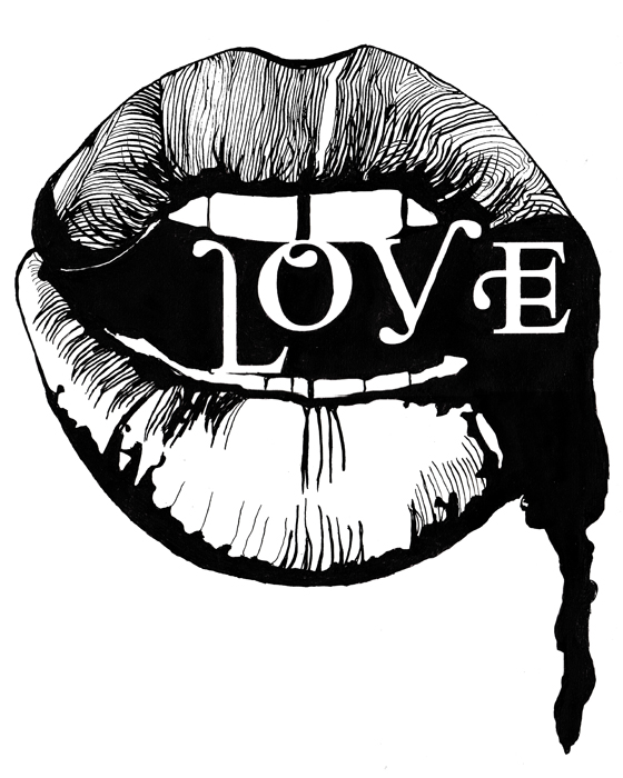
 One. Friends of type


looking at this article, i can see many endless possibilities in which different ways typography has been used and displayed aswell as the diffrent fonts and styles that make it diffrent between each image and will help to give inspiration for idea generation for my current typography project.


Two.


                            Reviving Caslon:Part 2: Readability, Affability, Authority


"I. READABILITY


What does it mean for a text to be “readable”? In English some have made a distinction between legibility and readability:
“Legibility” is based on the ease with which one letter can be told from the other. “Readability” is the ease with which the eye can absorb the message and move along the line.”


Types of Typefaces (1967) p. 84-5.
The same distinction is discussed by Walter Tracy:
[Readability] describes the quality of visual comfort—an important requirement in the comprehension of long stretches of text, but, paradoxically, not so important in such things as telephone directories or air-line timetables, where the reader … is searching for a single item of information [and where legibility is most important].

Letters of Credit (1986), p. 31."


"A. THEORY

We can see in the following graphic that legibility of individual letters is indeed different from the readability of whole words:"


"All of the letters in “legible letters,” above can make easily readable words when they are used to form words with their mates in the same style and weight. However, when letters with different weights and styles are mixed, the words can only be read slowly, with difficulty. What this shows is that the design of individual letters is not enough to make for readability. Some kind of harmony among the letters is needed for our brain to be able to capture and process either individual letter parts, or whole letters, or both, so that we can quickly identify words.
This illustration suggests that the brain is putting some kind of grid or matrix over the word, and that it identifies letters and words by how the black and white fall within that matrix. This idea also accounts for two of the qualities that are prized in text type: regular rhythm and even color."


"Here, readability noticeably deteriorates with irregular spacing. Readability also suffers when rhythm is disrupted by irregular widths of characters:"


I had found this part of an article quite useful on the i love typography blog about the theory between readability and legibility when talking about type aswell as rhythm and the factor of colour and weight can take affect over the readability and legibility.
This is a good article because i know the difference between readability and legibility and using type in my current project, i will know to consider the factors of readability and legibility aswell as good and bad rhythm in typography.


Reading this article on kerning has made me aware of optical kerning and metric kerning and what they are and the differences that are distinguished between them and how to identify them from the diagram used.
i think this can be useful because when working with type i will be able to differentiate between optical and metric kerning, so i will be able to more correctly along side type and set it more properly when working with it in computer aided design.


i found this article quite useful because it allowed to me clearly and quickly understand typography's anatomy, typography's theory of sitting on a line and what/why they are there for, learning some of its theory of which i had only knew very little of, but i understand having a better grips and if be needed i can go back and refresh my memory.

it will be useful terminology for when talking about typography i can clearly talk about its elements and get my point across more effectively and be understood better.
it will help me, if i needed to create my own typography as i can using reference to this to direct it against the guidelines.


Five. Daily drop cap


you can use drop caps as the first letter of a word in a paragraph, that is made larger in a separate text box and sometimes can be a diffrent font or have decoration to it unlike the rest of the text in a attempt to draw your eye to the beginning section of the text.
Before this i did not understand its function as a drop cap or that it was even called a drop cap unlike i do now, this helped me to realise.

i think its a useful article because it shows how modern drop caps can work affectively in diffrent styles, work both either black and white or brightly coloured and be used to dress up the look of text to really capture your attention as well as being curious as to what drops caps is used for it made me find out because of that.